
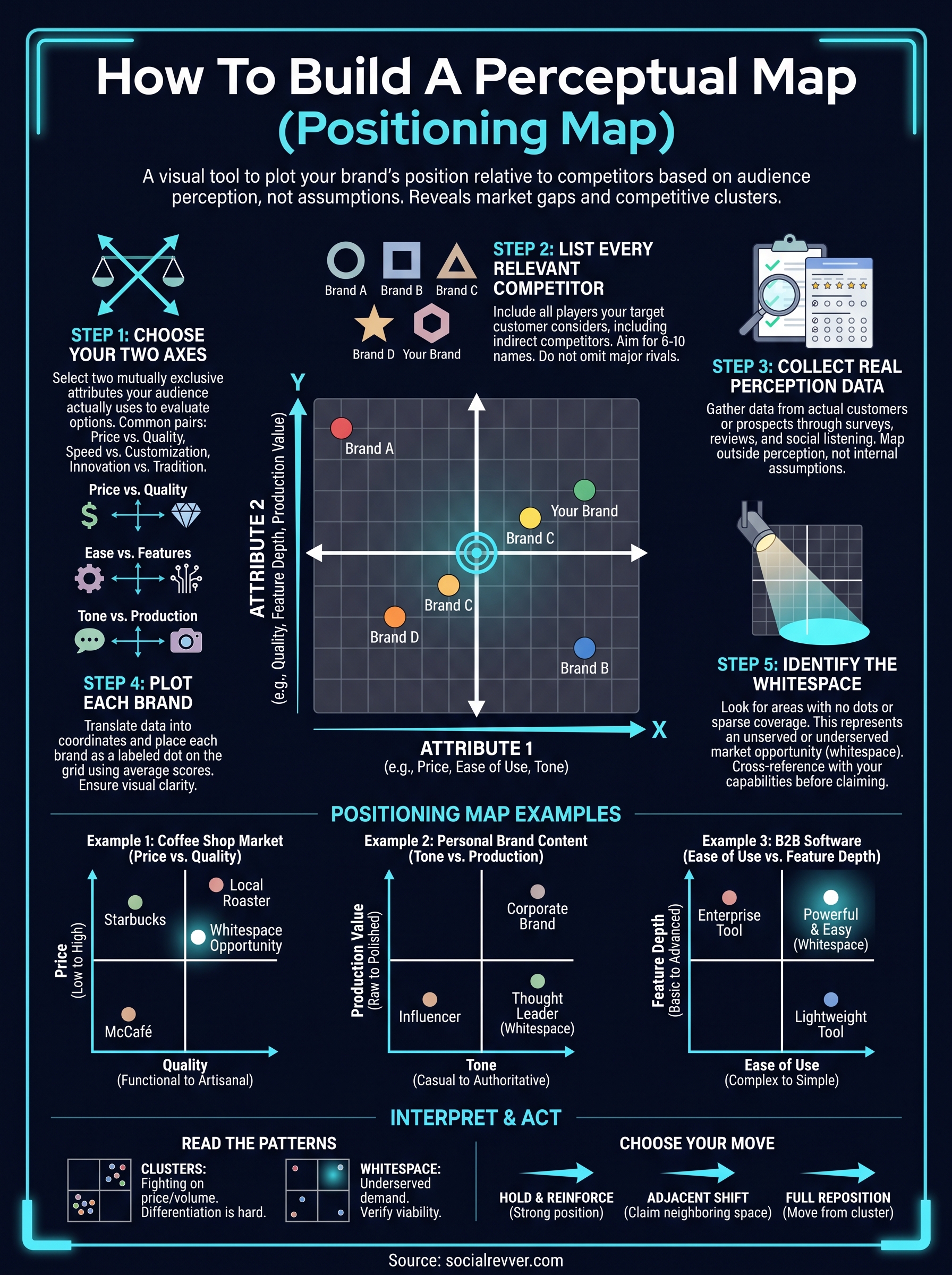
A positioning map example does something most strategy documents fail to do, it shows you exactly where your brand sits relative to competitors in a single visual. No spreadsheets, no guesswork, just a clear picture of how your market actually perceives you versus everyone else fighting for the same audience.
The problem is that most founders and business owners skip this step entirely. They assume they know their position because they know their product. But perception and reality rarely align, and the gap between the two is where market share gets lost. A perceptual map forces you to confront that gap with data instead of assumptions.
At SocialRevver, we see this disconnect constantly. Clients come to us wanting to scale their short-form content and build authority, but they haven't mapped where they actually stand in their audience's mind. Before you can engineer attention, before scripts, hooks, or distribution strategies matter, you need to know your starting coordinates. That's what a positioning map gives you.
This article breaks down what a positioning map is, walks through real examples you can reference, and gives you a step-by-step process for building one yourself. Whether you're launching a new brand, repositioning an existing one, or simply trying to find the white space your competitors haven't claimed, you'll leave with a framework you can put to work immediately.
What a positioning map is and how it works
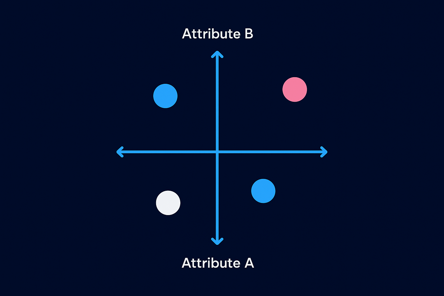
A positioning map, also called a perceptual map, is a two-dimensional chart that plots your brand and your competitors against two attributes your audience actually cares about. Those attributes become the X and Y axes. Each brand gets a dot based on how customers perceive it on those two dimensions, not how the brand perceives itself. The result is a visual snapshot of the competitive landscape that makes patterns immediately obvious. You can spot who's clustered together, who's isolated, and where large segments of customers exist with no brand serving them well.
The two axes that drive everything
Choosing your axes is the most important decision you make when building a positioning map. Pick the wrong attributes and the map tells you nothing useful. The axes must reflect what your target audience actually uses to evaluate options, not what you think sounds strategic. Common axis pairs include price versus quality, innovation versus tradition, niche versus mass market, and speed versus thoroughness. The right pair depends entirely on your category and what drives purchase decisions within it.
Here are the most common axis combinations by business type:
- Consumer brands: Price (low to high) vs. Quality (low to high)
- Tech products: Ease of use (simple to complex) vs. Feature depth (basic to advanced)
- Service businesses: Speed of delivery (slow to fast) vs. Customization (generic to bespoke)
- Content and media brands: Tone (casual to authoritative) vs. Production value (raw to polished)
Your axes need to be mutually exclusive, meaning one axis should not automatically determine the other. If you pick "expensive" and "premium," those two things move together and your map collapses into a diagonal line with no useful separation between competitors.
How brands get plotted on the map
Once you set your axes, you place each competitor, including yourself, at a coordinate that reflects how your audience perceives that brand, not how the brand markets itself. This is what separates a positioning map from an internal strategy document. The data that informs the placement should come from real sources: customer surveys, review sentiment, social listening, or structured interviews. You are mapping perception, not intention.
The gap between how you intend to be perceived and how you are actually perceived is the most expensive gap in your business.
A useful positioning map example from the automotive industry would plot brands like Ferrari, Toyota, BMW, and Kia on a price-versus-performance grid. Ferrari lands top right (high price, high performance), Kia lands bottom left (low price, moderate performance), and Toyota sits in the middle leaning toward value. No one has to explain this, because the visual makes it self-evident. That same clarity is what you're building for your own category, so decisions about messaging, content, and offers become obvious rather than debated.
Why the visual format matters
Your brain processes spatial relationships far faster than it processes rows of data. When you see two competitors sitting directly on top of each other on a map, you immediately understand that those brands are fighting for the same perception in the same customer's mind. That insight, which might take three pages of competitive analysis to convey in text, lands in under a second visually. That speed is why positioning maps remain one of the most practical tools in brand strategy.
When to use a positioning map and why it matters
A positioning map isn't a tool you pull out once and file away. Five specific business situations make it the right call, and recognizing them early saves you from making expensive decisions based on gut instinct alone. The clearer your picture of the competitive landscape before you act, the more precise your strategy becomes.
The five situations that call for a positioning map
You need a positioning map whenever the stakes of a positioning decision are high and getting it wrong will cost you time, money, or market share. That covers more situations than most founders expect.
- Launching a new product or brand: You need to know where space exists before you enter the market.
- Repositioning an existing brand: If your current position isn't converting, you need data showing where to move.
- Entering a new market or geography: What works in one region may already be crowded somewhere else.
- Responding to a new competitor: A new entrant can shift the whole map, and you need to see how.
- Rebuilding your content or messaging strategy: Before you change how you communicate, confirm where you currently sit in your audience's mind.
Each of these situations shares one common thread: a decision that requires you to understand relative position, not just absolute performance. Your revenue numbers tell you how you're doing. A positioning map tells you why and against whom.
Why skipping this step costs you
Most founders skip the map because they believe their instincts about the market are accurate. That confidence is usually the problem. You built the product, you live inside the brand, and that proximity distorts your perception of how an outside audience sees you compared to alternatives.
The cost of a bad positioning decision isn't just a failed campaign. It's months of content, budget, and attention pointed in the wrong direction.
Any credible positioning map example from a mature industry shows brands that looked identical to founders but landed in completely different quadrants once real customer perception data replaced internal assumptions. The map doesn't lie. Your instincts sometimes do.
How to build a perceptual map step by step
Building a perceptual map takes less time than most strategy work, but it demands honest data and the right sequence. Follow these five steps in order and you'll produce a working positioning map example you can use to make real decisions rather than debate assumptions.
Step 1: Choose your two axes
Your axes define what the map measures, so choose them based on what your audience actually uses to compare options, not what makes your brand look good. Run a short customer survey or pull themes from reviews and comments to identify the top two decision factors in your category. Write each axis as a clear spectrum with a defined low end and a defined high end so placement stays consistent across all competitors.
Step 2: List every relevant competitor
Pull together every brand your target customer might consider as an alternative, including indirect competitors who solve the same problem differently. Aim for six to ten names. Leaving out a major player because you dislike their product distorts the entire map and defeats the purpose of the exercise.
An incomplete competitor list produces a positioning map that flatters you rather than informs you.
Step 3: Collect real perception data
This step separates a useful map from a guess. Survey actual customers or prospects and ask them to rate each brand on your two axis dimensions using a simple numbered scale. You can also pull from review sentiment or social listening. The source matters less than the fact that it reflects outside perception, not internal assumption.
Step 4: Plot each brand
Translate your data into coordinates and place each brand as a labeled dot on the grid. Use the average score from your research for each axis dimension rather than your own read. Keep the visual clean and readable so patterns become obvious at a glance.
Step 5: Identify the whitespace
Look for areas on the map with no dots or sparse coverage where real customer demand still exists. That gap represents an unserved or underserved position. Cross-reference it with your actual capabilities before claiming it, because a position you can't credibly hold will cost you audience trust faster than any competitor can.
Positioning map examples you can copy
Real examples make the framework click faster than any abstract explanation. The three positioning map examples below cover distinct industries and axis combinations, so you can borrow the structure that matches your category and adapt it rather than starting from scratch.
The coffee shop market: price vs. quality
This is the classic entry point because the competitive landscape is familiar to almost everyone. Plot the price axis from left (low cost) to right (premium), and the quality axis from bottom (functional) to top (artisanal). Starbucks lands upper-middle: expensive but not truly artisanal. McDonald's McCafé sits lower-left, cheap and fast. A local third-wave roaster lands top-right, high price and high craft. The whitespace on this map typically appears in the mid-price, high-quality zone, which is exactly where successful regional chains have carved out loyal customer bases.
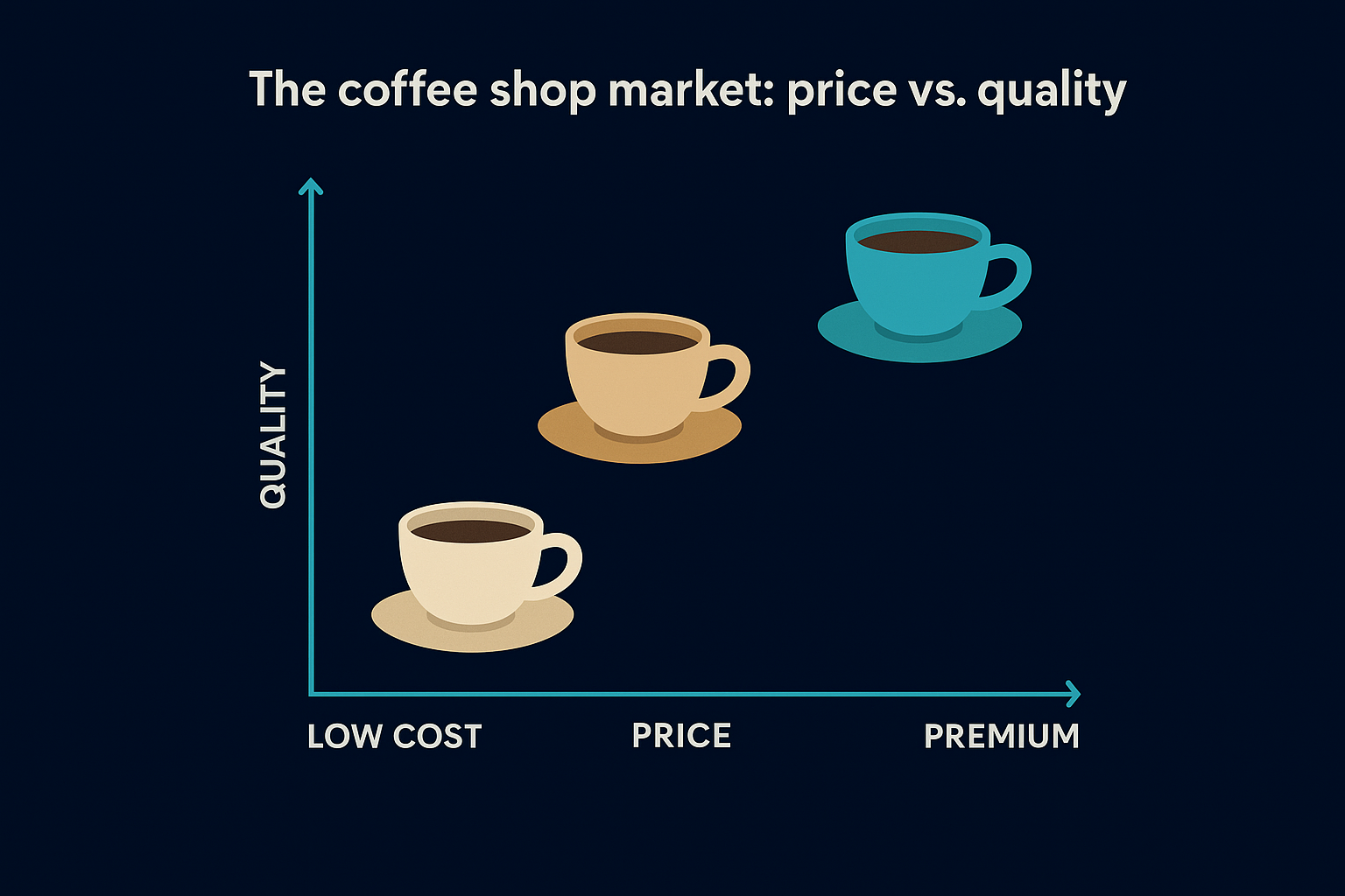
The brands that win whitespace are rarely the most innovative. They are the most accurate about where perception gaps actually exist.
The personal brand content space: tone vs. production value
For founders and creators, this axis pairing reveals crowding you can't see until you draw it out. Plot tone horizontally from casual (left) to authoritative (right), and production value vertically from raw (bottom) to polished (top). Most influencer-style creators cluster in the casual, raw lower-left. Corporate brands stack in the authoritative, polished upper-right. The lower-right quadrant sits largely open: raw delivery paired with authoritative substance is where direct, no-theater thought leaders tend to dominate with minimal competition and strong audience trust.
Here is where most personal brands end up without a map:
- Competing in the most crowded quadrant without knowing it
- Mimicking a competitor's tone instead of finding open space
- Defaulting to polished production when raw authority would convert better
The B2B software category: ease of use vs. feature depth
Software markets make the pattern highly visible. Plot ease of use horizontally from complex (left) to simple (right), and feature depth vertically from basic (bottom) to advanced (top). Enterprise tools sit upper-left: deep features, steep learning curve. Lightweight tools for small teams cluster lower-right. The upper-right quadrant, genuinely powerful and easy to use, remains underserved in most categories, which is why any brand that credibly claims it tends to grow without heavy acquisition spend.
How to interpret the map and choose a move
Once your positioning map example is plotted and labeled, the instinct is to immediately look for whitespace and claim it. Resist that. Your first job is to read the patterns across the whole map before drawing any conclusions about where to move. The full picture tells you more than any single open quadrant does.
Read the clusters first
Clusters are where two or more competitors share nearly identical coordinates on your map. When you spot one, it signals two things: that position is proven to attract customers, and that anyone sitting inside that cluster is fighting on price and volume alone. Differentiation is impossible from inside a cluster because your audience has no perceptual reason to choose you over the alternative. If your brand is inside one, that alone tells you repositioning is overdue.
Winning inside a cluster requires out-spending your competitors. Winning outside a cluster requires out-thinking them.
Look also at the distance between competitors outside the clusters. Wide gaps usually signal underserved demand, but they can also signal a position nobody has tried because it doesn't convert. You need to cross-check any open quadrant against real customer demand before treating it as an opportunity.
Pick your move based on what you can defend
Three moves are available once you've read the map, and the right one depends entirely on your current capabilities and credibility. Moving to an open position you cannot credibly hold destroys trust faster than staying in a crowded one does.
Here are the three moves and when each applies:
- Hold and reinforce: Your position is strong and differentiated. Double down on the attributes that placed you there.
- Adjacent shift: You're near open space and have the assets to credibly claim a neighboring position without a full rebrand.
- Full reposition: Your current position is inside a cluster or no longer matches what your audience values. This requires new messaging, new proof points, and a longer timeline.
Choose based on what your audience already believes about you, not on what you wish they believed. The map shows you where perception currently lives. Your strategy decides where it goes next.
What to do after you map the market
Your positioning map example is only useful if it drives a real decision. The map itself doesn't grow your brand. The action you take based on what the map reveals does. Once you've identified your current position, your next step is to align every external signal your audience sees with the position you intend to own. That means your content, your messaging, and your production quality all need to consistently point at the same coordinates on that grid. Without that alignment, your map becomes a strategy artifact instead of a growth tool.
Short-form content is one of the fastest and most measurable ways to shift market perception at scale. If your map shows you need to move toward authority or higher production value, your content strategy is the engine that gets you there. That's where SocialRevver comes in. Apply for your free 40+ slide social media strategy and start building content that moves your brand to the position your market actually rewards.