
The Google Analytics retention report tells you something most dashboards won't: whether people actually come back after their first visit. It's one thing to drive traffic, it's another to hold attention long enough to build real authority and generate repeat engagement. For founders, business owners, and creators investing in organic content, this distinction matters more than raw view counts ever will.
At SocialRevver, our entire system is built around turning short-form content into a predictable growth engine. But predictable growth requires measurement, and GA4's Retention report is one of the clearest tools for understanding whether your content strategy is creating lasting connections or one-time drive-bys.
This guide breaks down how to find the Retention report in GA4, what each metric and chart actually means, and how to use the data to make smarter decisions. We'll also cover the commonly confused Data Retention settings, which control how long Google stores your data, so you're clear on both sides of "retention" in GA4.
What the GA4 retention report shows and what it does not
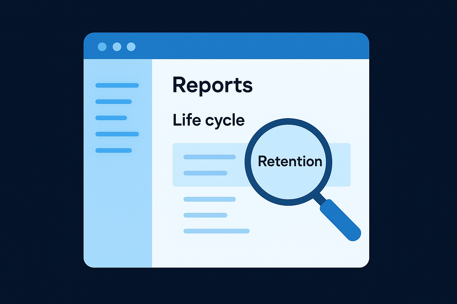
The google analytics retention report in GA4 lives inside the Life cycle collection under the Reports section. It gives you a time-based view of how many users return to your site or app after their first visit. GA4 organizes this data around two core concepts: new users (people visiting for the first time) and returning users (people who have come back at least once). The report defaults to a 42-day window, which gives you enough range to identify real behavioral trends rather than random day-to-day noise.
What the report actually tracks
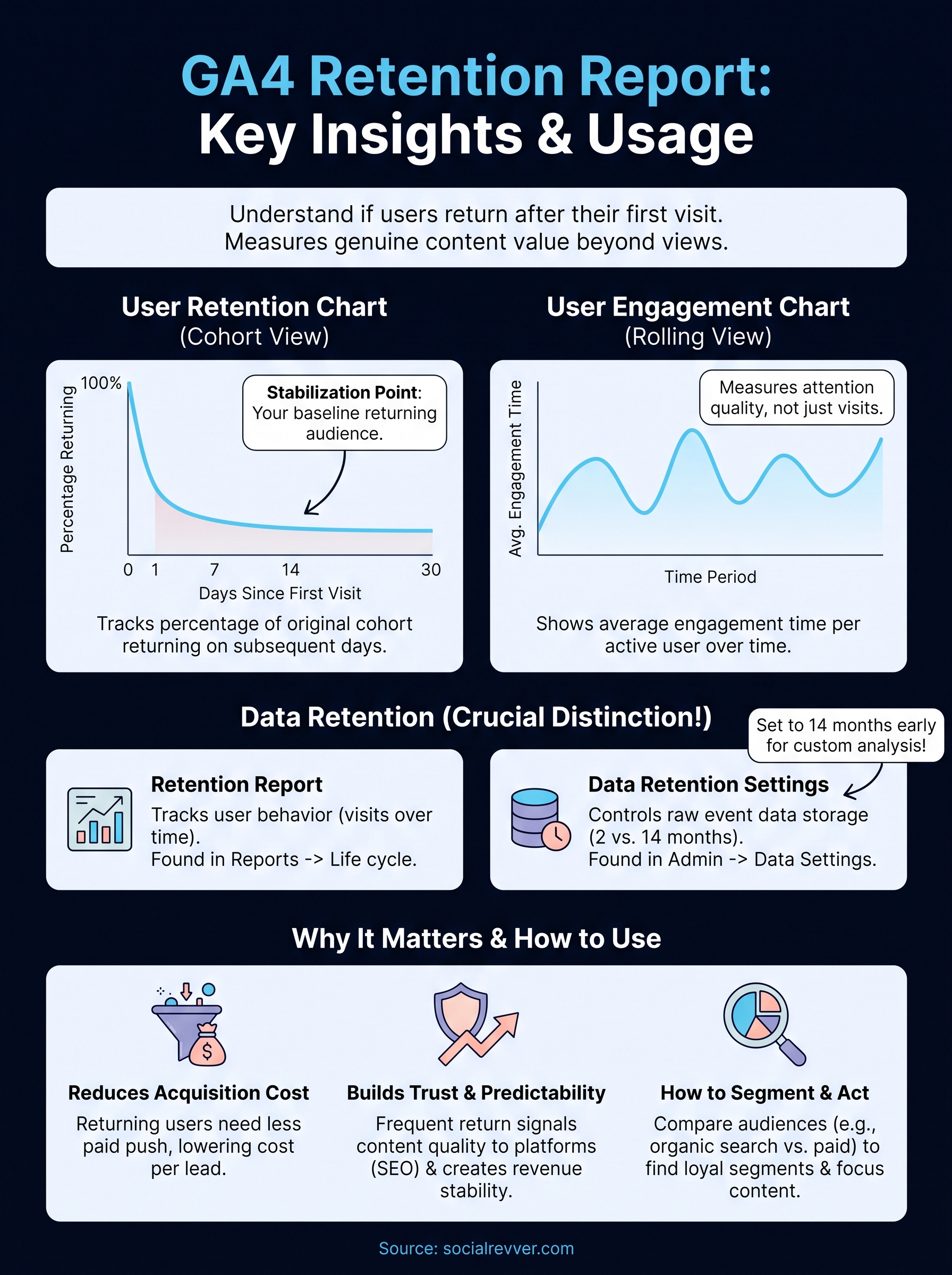
GA4 measures retention using user cohorts, which are groups of users organized by the day, week, or month they first visited your site. For each cohort, the report tracks what percentage of those users return on day 1, day 7, day 14, and so on. The result is a retention curve that drops sharply after day 0 for most sites and then flattens over time. How steep that drop is, and where the curve levels off, tells you whether your content creates genuine reasons to come back.
The report also includes a rolling retention view, which shows how many users were active on any given day within the selected time range, regardless of when they first visited. This differs from cohort-based retention because it tracks overall active user volume rather than following a specific group forward from their entry date. Both views together give you a more complete picture of engagement than session counts or bounce rates can provide on their own.
The shape of your retention curve is one of the most honest signals in your analytics stack: it reflects what your audience does when no paid promotion is pushing them back.
What the report does not show
Understanding the limits of the data matters just as much as knowing what the report tracks. GA4's retention report shows behavioral patterns but offers no direct explanation for why users return. You cannot identify which specific piece of content, video, or landing page brought someone back just by reading this report. For that attribution layer, you need to cross-reference with GA4's traffic source reports and landing page data separately.
The report also struggles with cross-device accuracy unless your users are signed into a Google account or you have implemented User-ID tracking. A visitor who first arrives on mobile and returns on desktop may register as two separate users, which skews your cohort numbers. GA4 applies probabilistic modeling to bridge some of these gaps, but you should treat those blended estimates as directional signals rather than precise counts.
Finally, the retention report is not a customer lifecycle tool. It gives you aggregate behavioral data for web and app users, not the kind of identified-customer tracking you get from a CRM. What it does well is give you a fast, reliable read on whether your content is building habitual behavior across your audience at scale. That is its actual job, and within those boundaries, it does it well.
Why retention matters for acquisition, trust, and revenue
Most analytics conversations focus on traffic volume, but returning users tell a more valuable story. When someone visits your site or app more than once, they signal that your content earned their attention on the first visit and gave them a reason to seek you out again. The google analytics retention report turns that behavioral signal into a measurable metric you can track over time and use to inform real decisions.
Retention reduces your acquisition costs
When your retention rate improves, you spread your content production and distribution costs across a larger base of engaged users who need no additional paid push to return. That math directly improves the efficiency of any budget you spend on growth, whether that is paid ads, SEO, or short-form video.
A well-retained audience also compresses your funnel conversion timeline. Users who have already visited multiple times carry a higher baseline of familiarity and trust, which means they convert faster and require fewer touchpoints before they take action. Every percentage point of improvement in day-7 retention compounds into measurable reductions in your cost per lead over months.
Retention is not a vanity metric: it is the multiplier that determines whether your content investment pays off or just generates one-time traffic spikes.
Retention builds platform trust and revenue predictability
Search engines and social platforms both use engagement signals to evaluate content quality. When users return frequently to your site, platforms interpret that pattern as a signal that your content delivers genuine value. That interpretation translates into better organic distribution, which reinforces the cycle of discovery and return.
From a revenue standpoint, high retention creates a predictable base of active users that makes forecasting far more reliable. Whether you monetize through brand partnerships, product sales, or service inquiries, a consistent returning audience gives you a stable floor from which to build. Sporadic traffic might look impressive in a weekly report, but predictable returning users are the foundation that turns content into a durable business asset.
How to access and set up the retention report in GA4
Before you can use the google analytics retention report, you need to locate it inside GA4, which organizes its reports differently from Universal Analytics. The report is not on the default home screen, so new users often miss it entirely. GA4 requires a property with at least several weeks of active data collection before the retention charts display meaningful patterns rather than sparse, incomplete cohort rows that give you nothing useful to act on.
Finding the report in GA4
Log into your GA4 property and click "Reports" in the left-hand navigation panel. From there, look for the "Life cycle" collection, which is a group of reports focused on how users move through your site or app over time. Expand that collection and select "Retention." If you do not see the Life cycle section, your account may use a customized navigation layout, in which case you can search for "Retention" directly using the search bar at the top of the Reports panel. GA4 will surface it immediately.
If your GA4 property is brand new, give it at least two to four weeks of data collection before drawing conclusions from the retention charts.
Adjusting the date range and comparisons
Once inside the report, the first adjustment you should make is the date range selector in the top-right corner. GA4 defaults to the last 28 days, but extending that window to 90 days or longer gives your cohort data enough room to show meaningful return patterns. A short date range cuts off your retention curves before they flatten, which makes them harder to interpret with any confidence.
You can also use the comparison feature to stack two date periods side by side, which is particularly useful when you want to measure whether a content campaign, a product launch, or a new video series improved your day-7 or day-30 retention versus a prior period. Set your baseline period first, then add a comparison period using the same date range selector. GA4 displays both retention curves simultaneously, so the performance difference becomes visible without any manual calculation on your part.
How to read the retention report metrics and charts
The retention report in GA4 displays two primary charts and one cohort data table, and each one answers a different question about your audience's behavior. Reading them correctly requires understanding what the axes represent and what the numbers actually describe before you start drawing conclusions from the visual shapes you see on screen.
The user retention chart
The user retention chart is the main visualization in the report. The horizontal axis represents time in days since a user's first visit, and the vertical axis shows the percentage of that original cohort still returning on each subsequent day. Day 0 always shows 100% because it represents the day users first arrived. From there, the curve drops, and how quickly it falls tells you how well your content holds attention beyond the initial visit.
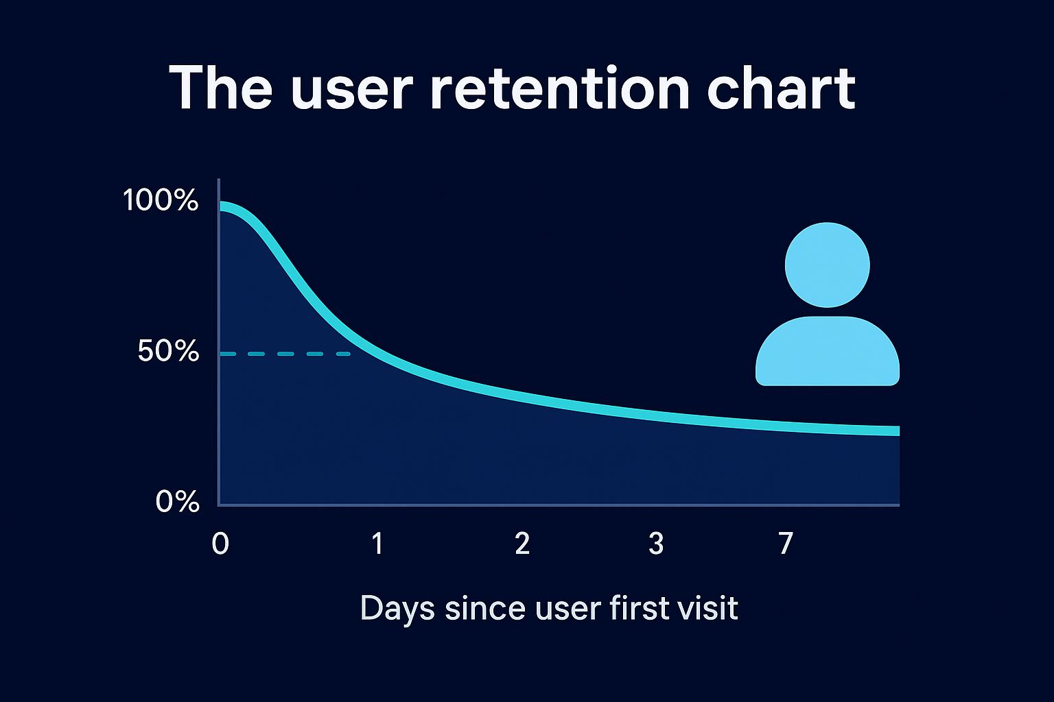
Most sites see a steep drop between day 0 and day 1, which is normal. What you want to focus on is where the curve stabilizes, because a flat line at even 10% or 15% means you have a consistent returning segment. A curve that drops to near zero and stays there signals that your content is not giving people a strong enough reason to return on their own.
The point at which your retention curve flattens is your real baseline audience: these are the people your content consistently earns back.
The user engagement chart
Below the retention curve, GA4 displays a user engagement chart that shows average engagement time per active user over the same time window. This chart helps you determine not just whether users return, but how much attention they give you when they do. A high return rate paired with low engagement time may suggest users are checking in briefly without finding new content worth consuming.
The cohort table beneath both charts breaks down retention percentages by individual cohort rows, organized by the week each group of users first arrived. Scan vertically down any single column, such as the "Week 1" column, to compare how well different cohorts retained at the same point in their lifecycle. That vertical comparison is one of the most practical ways to spot whether recent content changes are improving or hurting your day-7 and day-14 return rates.
How to segment retention to find what drives loyalty
The aggregate retention curve gives you a baseline, but the real insight comes when you break that data into segments to understand which audiences, channels, or behaviors actually drive return visits. GA4 does not offer built-in segmentation directly inside the google analytics retention report, but you can layer comparisons and use secondary reports to isolate the patterns that separate loyal users from one-time visitors.
Using audience comparisons to isolate behavior
GA4 lets you apply audience segments and user property filters at the property level through the Comparisons feature, which appears at the top of most standard reports. Before you open the retention report, build a custom comparison in GA4's Exploration tool using the User Lifetime template. This gives you more granular control to split users by attributes like device category, geography, or engagement level, so you can compare retention curves across those groups side by side.
The groups that retain at the highest rates are not always the largest: they are often a specific segment that your content resonates with most directly.
For example, if users arriving from organic search retain at day 7 at twice the rate of users from paid social, that tells you your SEO content builds stronger habitual behavior than your paid campaigns. That pattern is a clear signal to invest in content depth and topic authority rather than chasing broad reach through distribution alone.
Connecting retention to traffic source data
Open the Traffic Acquisition report under the Life cycle collection and look at which channels deliver the highest percentage of returning users alongside their raw session volumes. Cross-referencing that data with your retention curves gives you a practical map of which sources generate genuine loyalty versus which ones generate short-lived traffic that never returns.
Pay particular attention to direct traffic and organic search, because these channels consistently represent users who sought you out intentionally rather than reacting to a paid placement or algorithm push. Users arriving through those high-intent channels almost always produce stronger day-14 and day-30 retention rates, which makes them disproportionately valuable to your content strategy even when their total volume looks smaller than social or referral traffic in your dashboard.
Data retention settings in GA4 and how they affect reporting
The term "retention" in GA4 refers to two completely separate things, and confusing them leads to real reporting problems. The Retention report tracks how often users return to your site. The Data Retention setting, found inside your GA4 Admin panel, controls how long Google stores raw event-level data before automatically deleting it. These settings operate independently, but your Data Retention configuration directly limits how far back you can query historical data in Explorations and custom reports.
Where to find and change your data retention setting
Navigate to your GA4 property's Admin panel, select "Data Settings" under the Property column, then click "Data Retention." GA4 offers two options by default: a 2-month retention period and a 14-month retention period. Most properties ship with the 2-month default, which means any user-level and event-level data older than two months becomes unavailable for custom exploration queries. You can switch to 14 months at any time, though the extension only applies to data collected going forward, not retroactively to data already deleted.
Switch your data retention setting to 14 months as early as possible after creating a GA4 property, because you cannot recover data that Google has already purged under the shorter default window.
There is also a toggle labeled "Reset user data on new activity," which, when enabled, resets a user's retention clock every time they return to your site. Keeping this toggle on extends how long individual user records stay available for exploration queries, which gives you longer behavioral windows to analyze in custom reports tied to the google analytics retention report and related lifecycle data.
How retention settings interact with standard reports
Standard reports like the Retention chart and Traffic Acquisition report pull from aggregated data, not the raw event tables, so your Data Retention setting does not affect what you see in those pre-built views. The limitation only applies when you build custom explorations in the Explore section, where GA4 queries raw event-level data directly. If you rely exclusively on standard reports, a 2-month setting causes no visible gaps, but the moment you start building custom user journey analyses, that missing historical data becomes a real constraint on the depth of insight you can generate.
What to do next
You now have everything you need to work with the google analytics retention report effectively: how to find it, read it, segment it, and protect the underlying data with the right retention settings. The next step is to act on what you measure. Pull your current day-7 and day-14 retention rates, identify which traffic sources produce your most loyal users, and adjust your content focus to serve that audience more directly.
Retention improvement does not happen from a single report review. It comes from building a content system that consistently gives your audience a reason to return, and that requires a structured approach to strategy, production, and distribution working together. If you want a proven framework for turning short-form content into a predictable growth engine that drives measurable retention and revenue, apply to work with the SocialRevver team and get a free 40-slide social media strategy built for your brand.